Photographer’s
Portfolio
- Role
- UX/UI Designer
- Project type
- Website design
- Tool
- Figma
- Focus
- UX/UI DesignProduct DesignVisual Design
Introduction
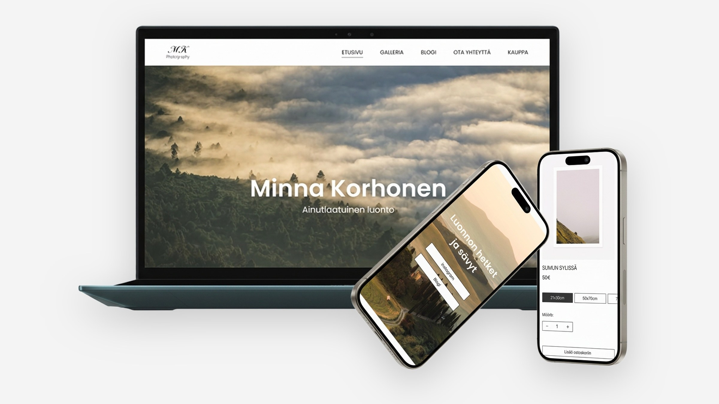
This project began as a website design collaboration for a professional nature photographer. I worked together with a student developer to explore different directions for the website structure and content, while also defining the visual direction based on the photographer’s preferences.
I created several layout and content concepts and explored how the website could present the photographer’s work in a clear and visually engaging way. The collaboration ended before the website was implemented.
I decided to continue developing the project independently in Figma, refining the user interface, responsive layouts and overall visual direction into a complete design concept. The final concept was not developed or published as a live website, but remained as an independent UI/UX design project in Figma. This project is made with fictional images.
Project goals & challenges
The website needed to support the photographer's visual work while remaining easy to navigate: photography at the centre, with a clear structure that makes the different types of content easy to discover.
The main challenge was balancing strong imagery with readable navigation and text, and carrying that balance into an elegant, responsive presentation across screen sizes.
Design goals
Image-first experience
The visual work should remain the primary focus of the website.
Clear structure
The navigation and content structure should make it easy to explore the photographer's work.
Consistent visual language
Typography, spacing, imagery and interface elements should work together as one coherent visual system.
Wireframes
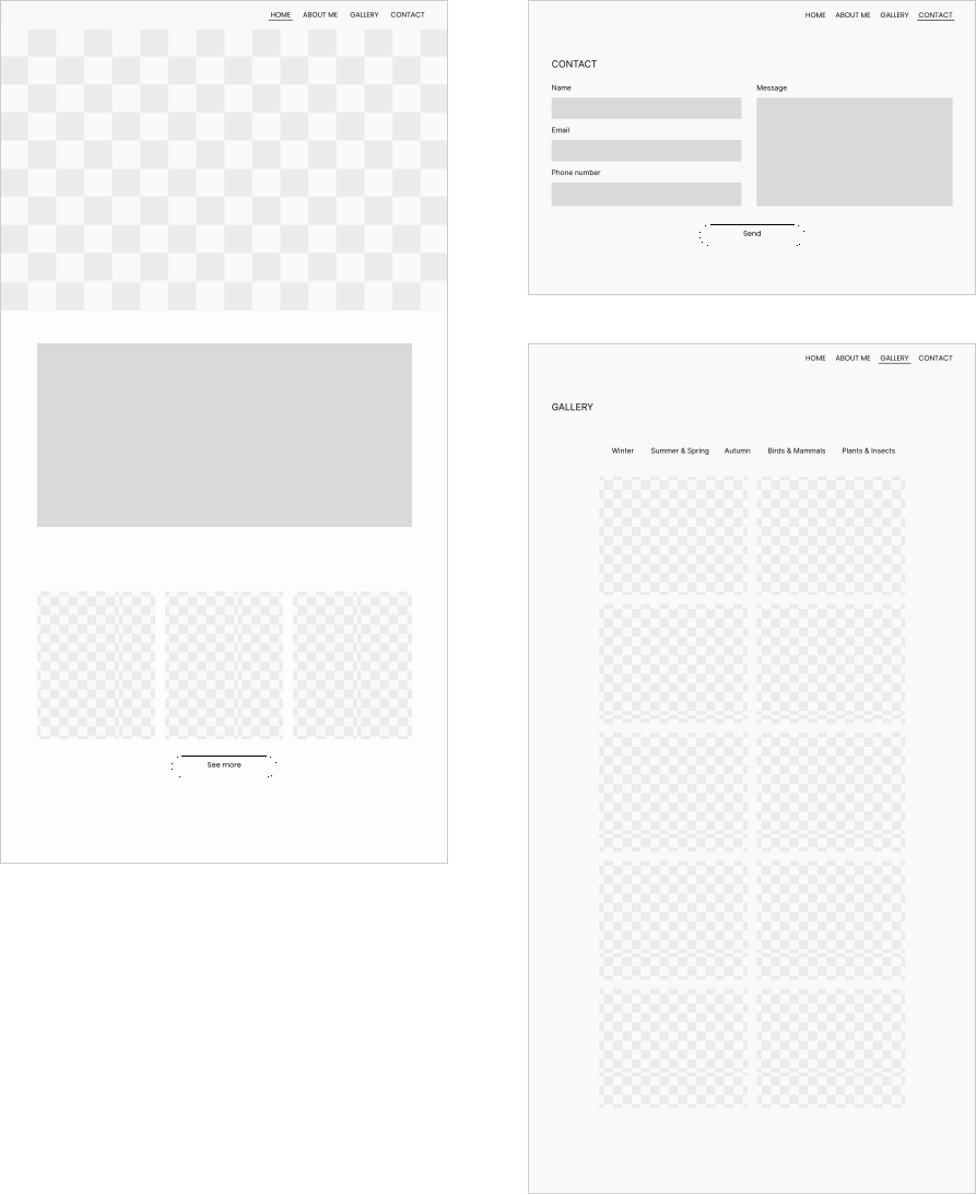
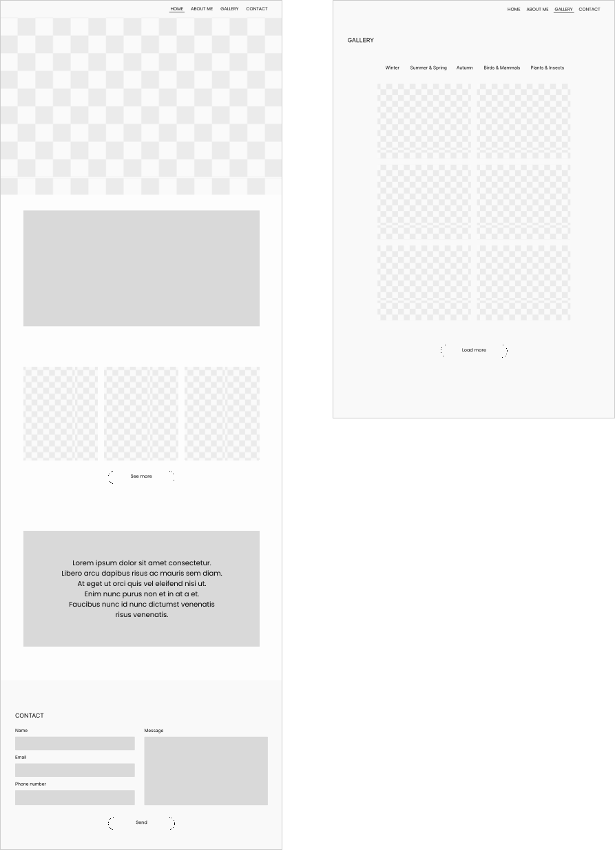
Wireframes were used to explore content hierarchy, page structure, image placement and navigation before any visual design was applied. I decided to use the first wireframe version.
Visual direction
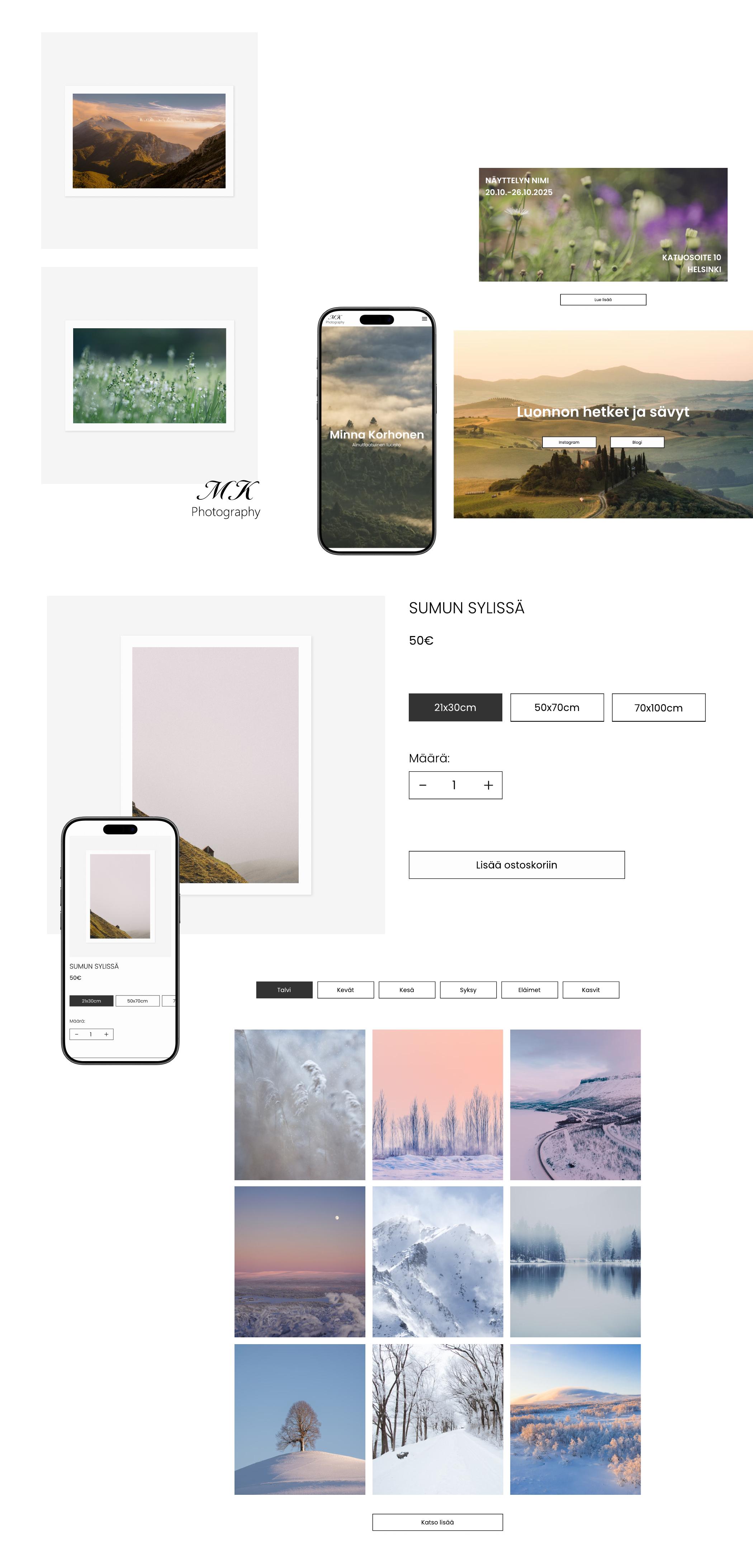
The visual direction was built around the photography. Typography stays restrained, layouts stay clear, and interface elements are kept to a minimum so the images always lead.
The result is intended to feel calm and editorial rather than decorative, with a deliberate balance between image and text.
Final design
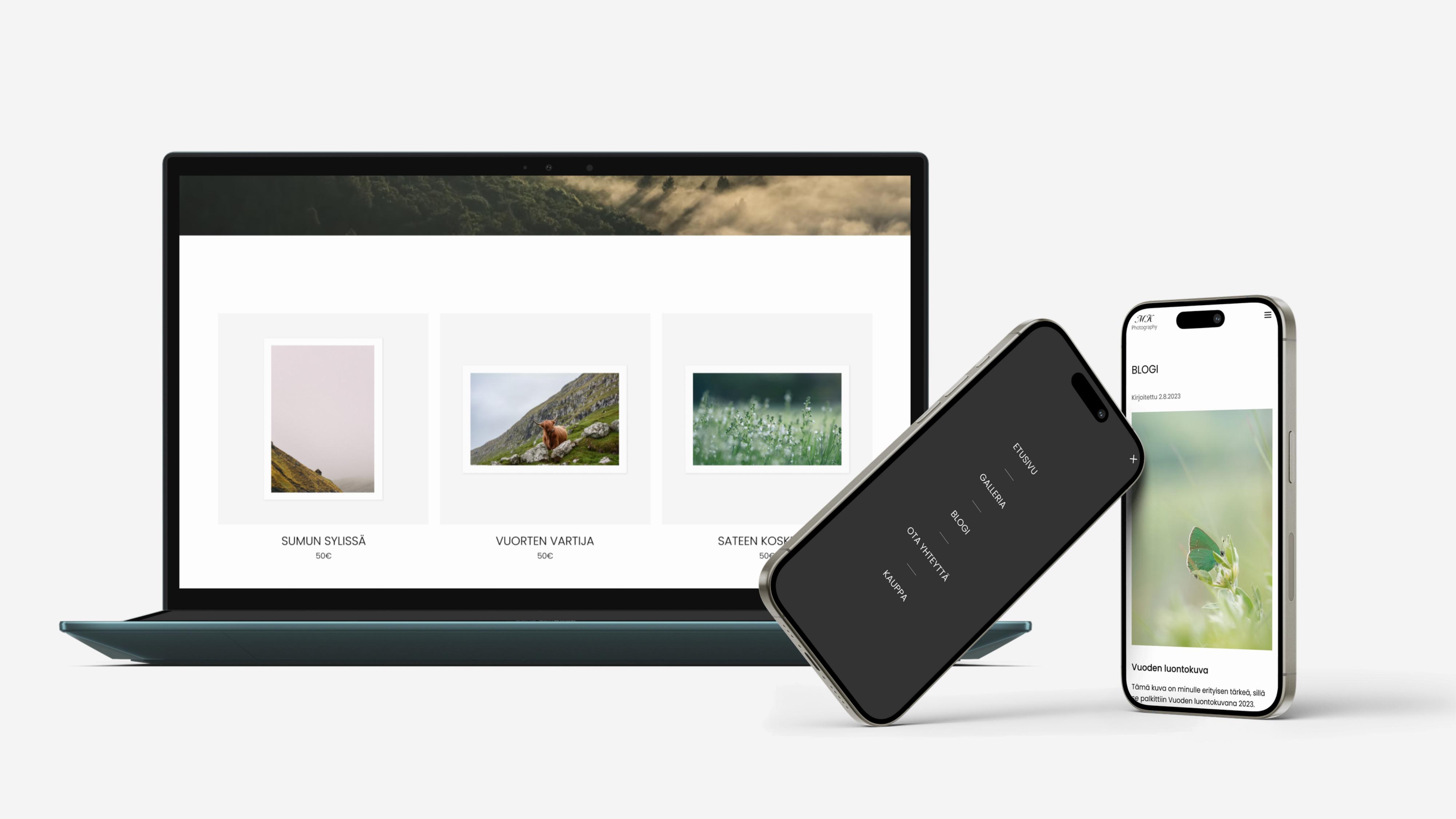
The final concept brings the explored structure and visual direction together into a responsive website design. The interface is intentionally restrained so that the photographer's work remains at the centre of the experience.