CIN CIN
- Role
- Graphic Designer
- Project type
- Visual identity for a fictional brand
- Tools
- Adobe IllustratorFigma
- Focus
- Graphic DesignVisual IdentityIllustration Design
Introduction
The concept was built around a wine bar offering natural wines and food. The visual identity was designed to communicate a relaxed atmosphere, modernity and personality while remaining warm and approachable, with a distinctive wine-bar character.
The result is a distinctive and approachable visual style built around a logo, an illustrated graphic element, typography and a defined colour palette.
Colour
The palette combines a strong black and red with a warm pale yellow and a soft white, creating contrast while keeping the identity elegant and distinctive.
Typography
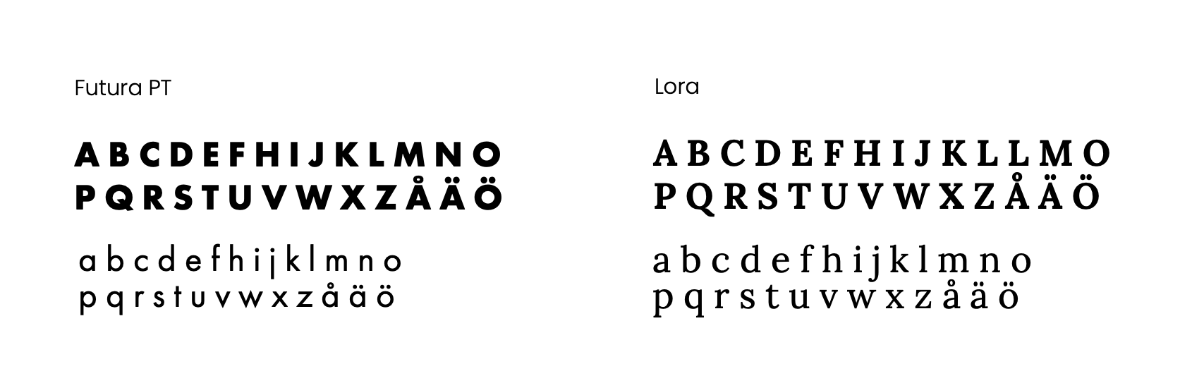
Futura PT
Used primarily for the logo and the strong typographic elements of the identity.
Lora
Used as a contrasting serif typeface, adding a softer and more expressive voice beside the geometric sans.
Logo &
graphic elements
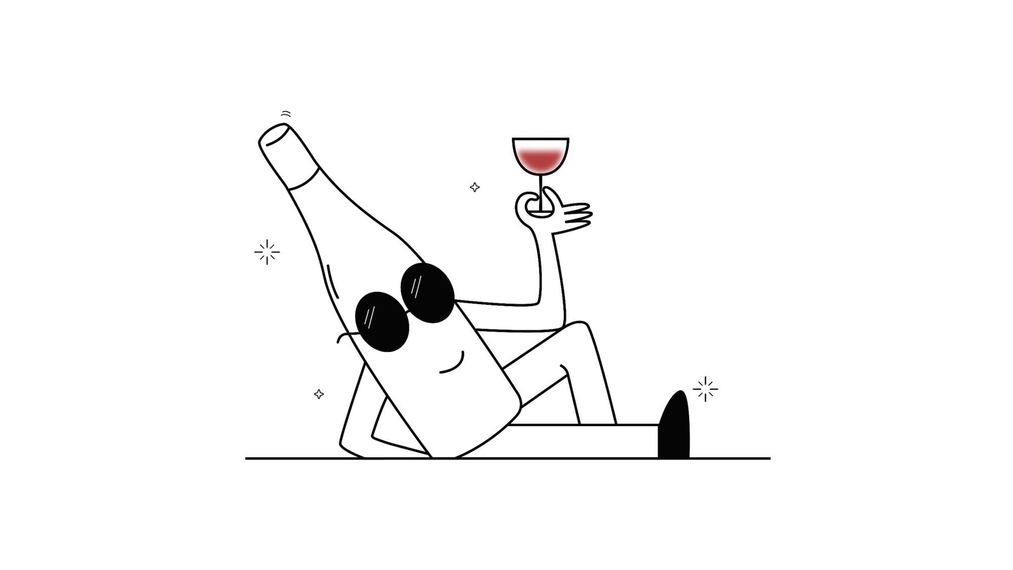
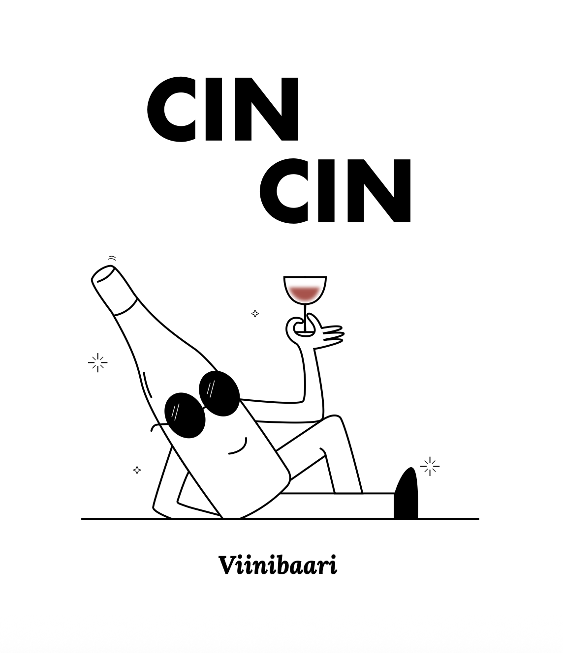
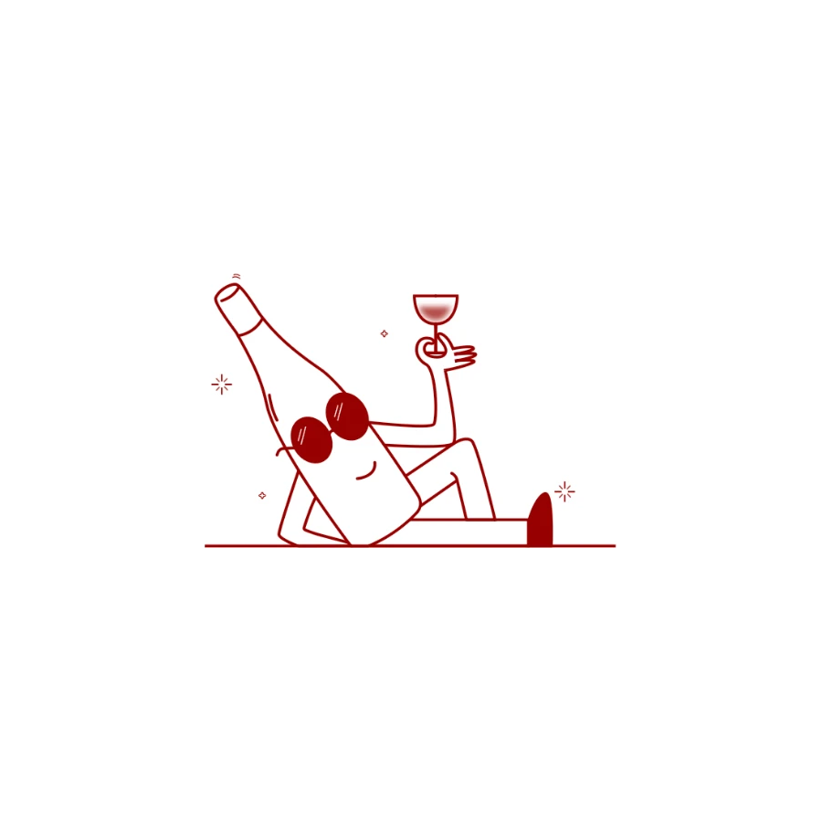
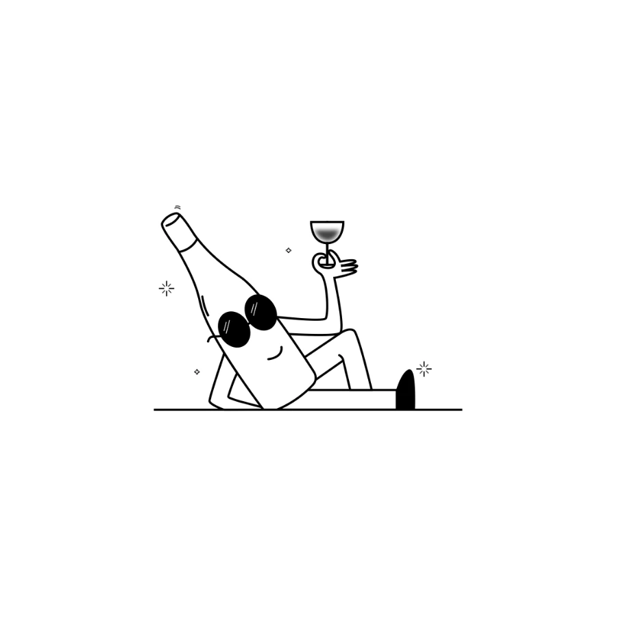
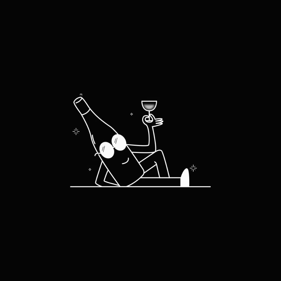
The illustration of a person holding a wine bottle and a glass was created as part of the visual identity. Together with the logo it gives the brand a recognisable graphic character and a clear visual personality in different compositions.

Logo in different colourways
Menu
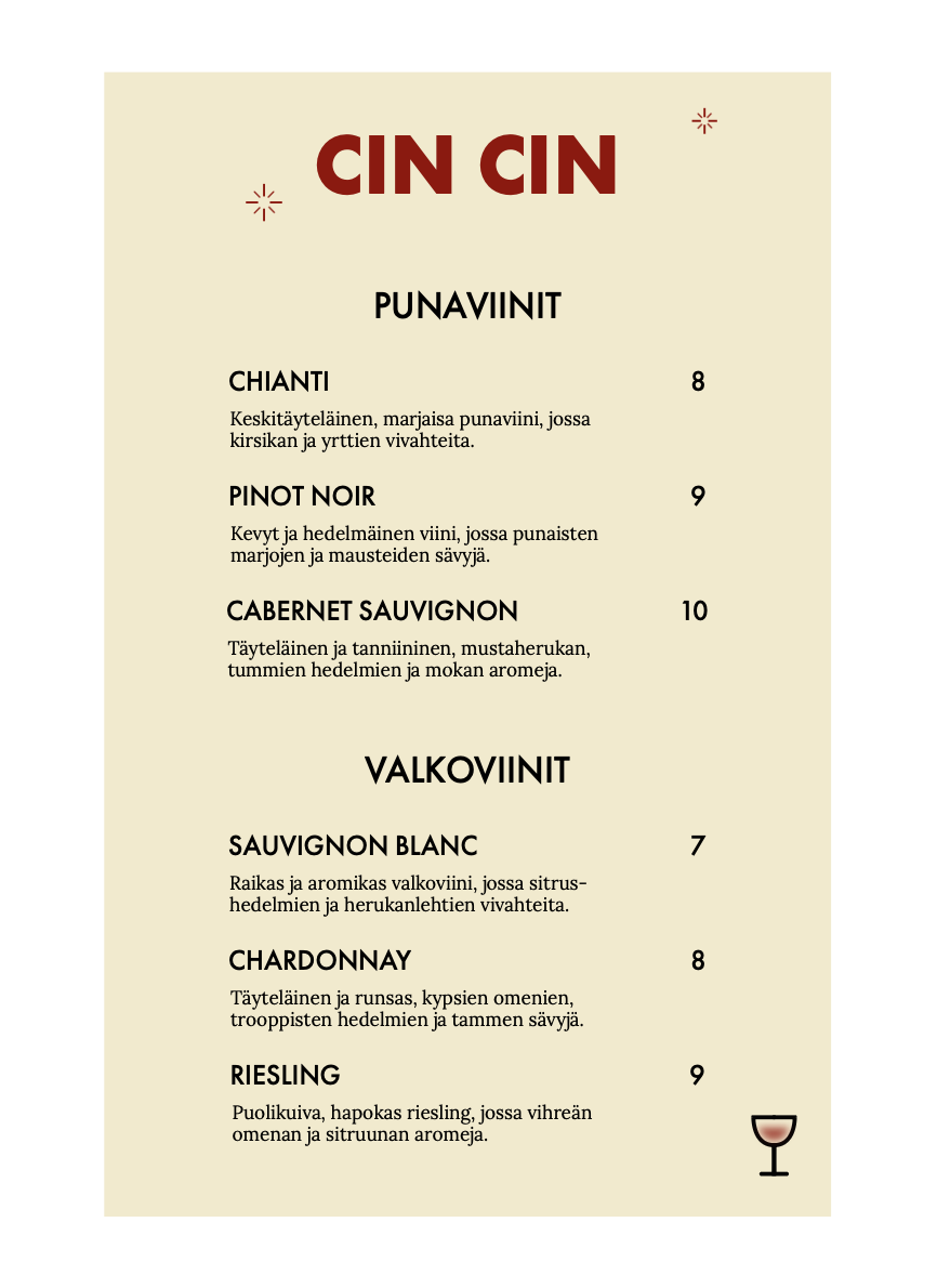
The menu concept brings the visual identity together through the red logo, illustration and pale yellow background, creating a cohesive layout that reflects the character of CIN CIN.
Website
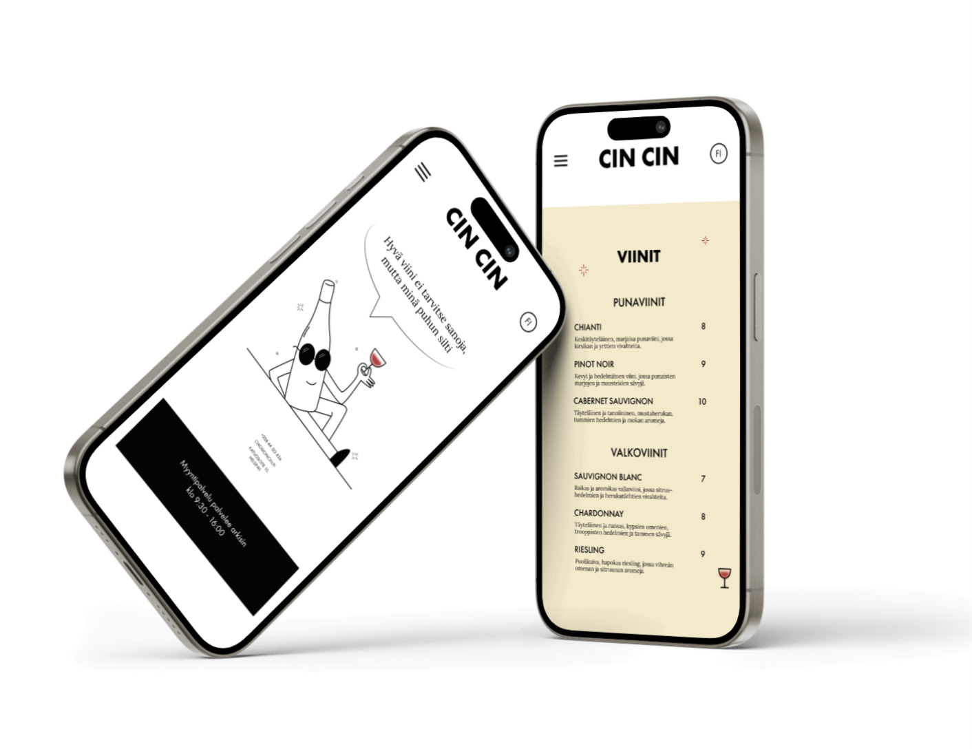
The website concept brings the CIN CIN identity into a digital setting, using typography, colour and illustration to create a cohesive visual expression that reflects the character of the brand.