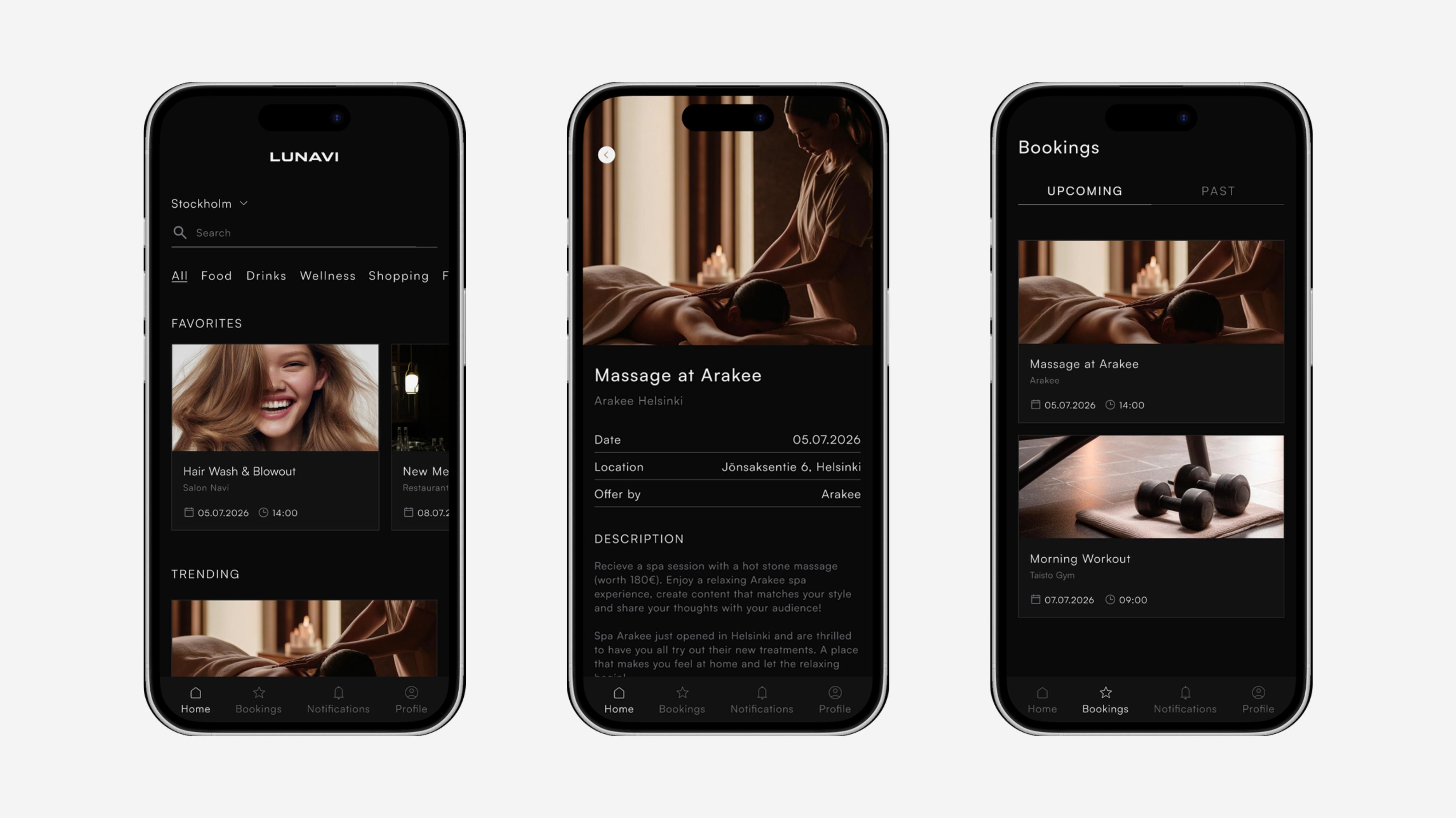
Lunavi
- Role
- UX/UI Designer
- Project type
- Application redesign
- Tool
- Figma
- Focus
- UX/UI DesignProduct DesignVisual Design
Introduction
Lunavi is a company working in influencer marketing and event production, collaborating with businesses and content creators. The company provides modern solutions for marketing and PR, particularly for the restaurant, beauty, fashion and wellness industries.
The main goal was to create a clearer, more consistent and user-friendly application while developing a visual direction that could be carried across the company's digital and visual materials.
Collaboration & individual responsibility
I worked as part of a two-person design team on the redesign of Lunavi's application. Together, we worked on the application's structure, user flows, navigation, UX/UI design, design system, wireframes and prototyping. We also developed the application's new visual direction and contributed to supporting visual materials.
My main individual responsibility was building and managing components and variables in Figma. This included creating reusable UI elements and structuring the design system so that the interface could remain consistent and easier to develop throughout the project.
Working with components and variables gave me a deeper understanding of how a design system can support not only visual consistency, but also a more efficient and scalable design workflow.
The challenge
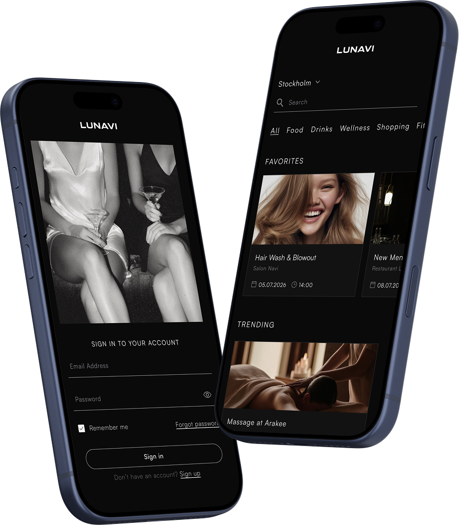
The existing application needed a clearer structure and a more consistent visual direction, so we wanted to create a new version that would feel more modern and coherent while also improving navigation and the overall user experience.
The challenge was not simply to redesign individual screens, but to understand how the application's structure, user flows, visual language and reusable components could work together as one system.
Side-by-side comparison of the existing application and the redesign


From structure to interface
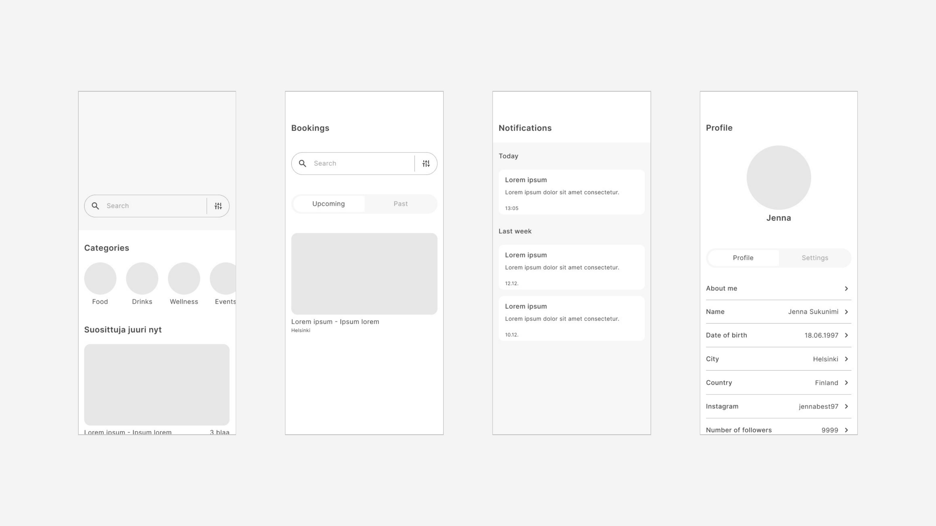
We started by looking at the existing application structure and identifying areas where the experience could be improved, exploring the navigation, user flows and relationships between different views before moving into detailed UI design.
Wireframes helped us focus on structure and functionality before introducing the final visual direction. This made it easier to evaluate the experience and make changes early in the process.
Designing the user experience
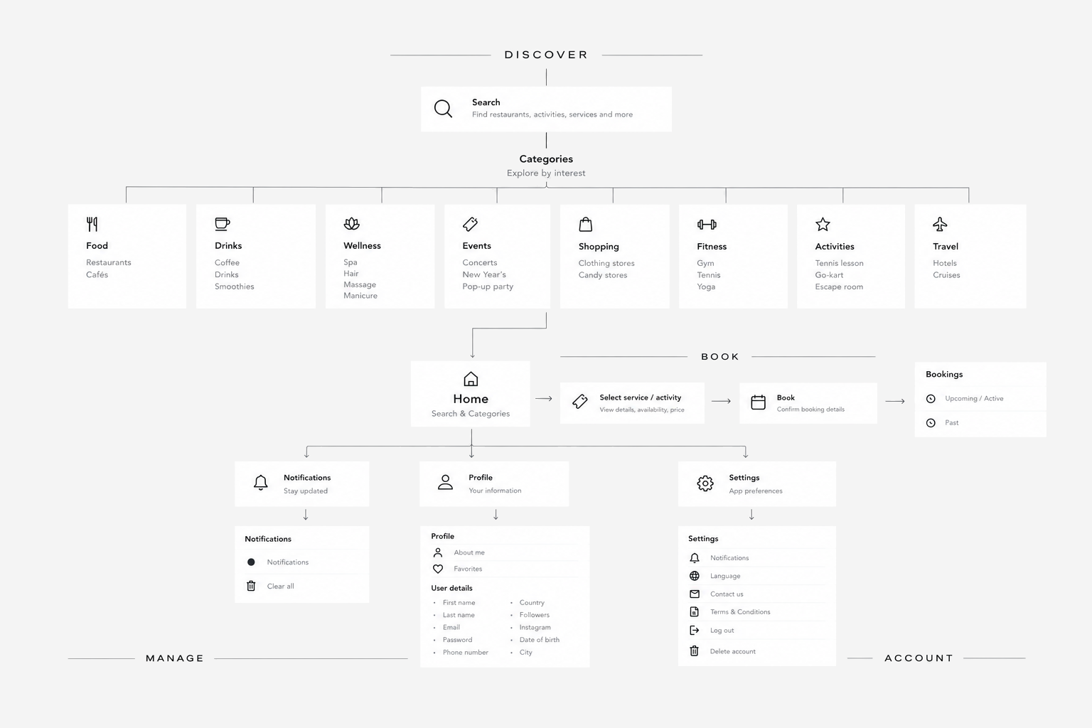
A major part of the project was designing how users move through the application, working on user flows, navigation and the logical structure of the service with the goal of making the experience feel intuitive and easy to follow.
The project helped me shift my perspective from looking at individual screens to thinking about the complete user journey.
Building the design system
One of the central parts of the project was developing a new design system for the application, including colours, typography, spacing, components, buttons, icons and variables.
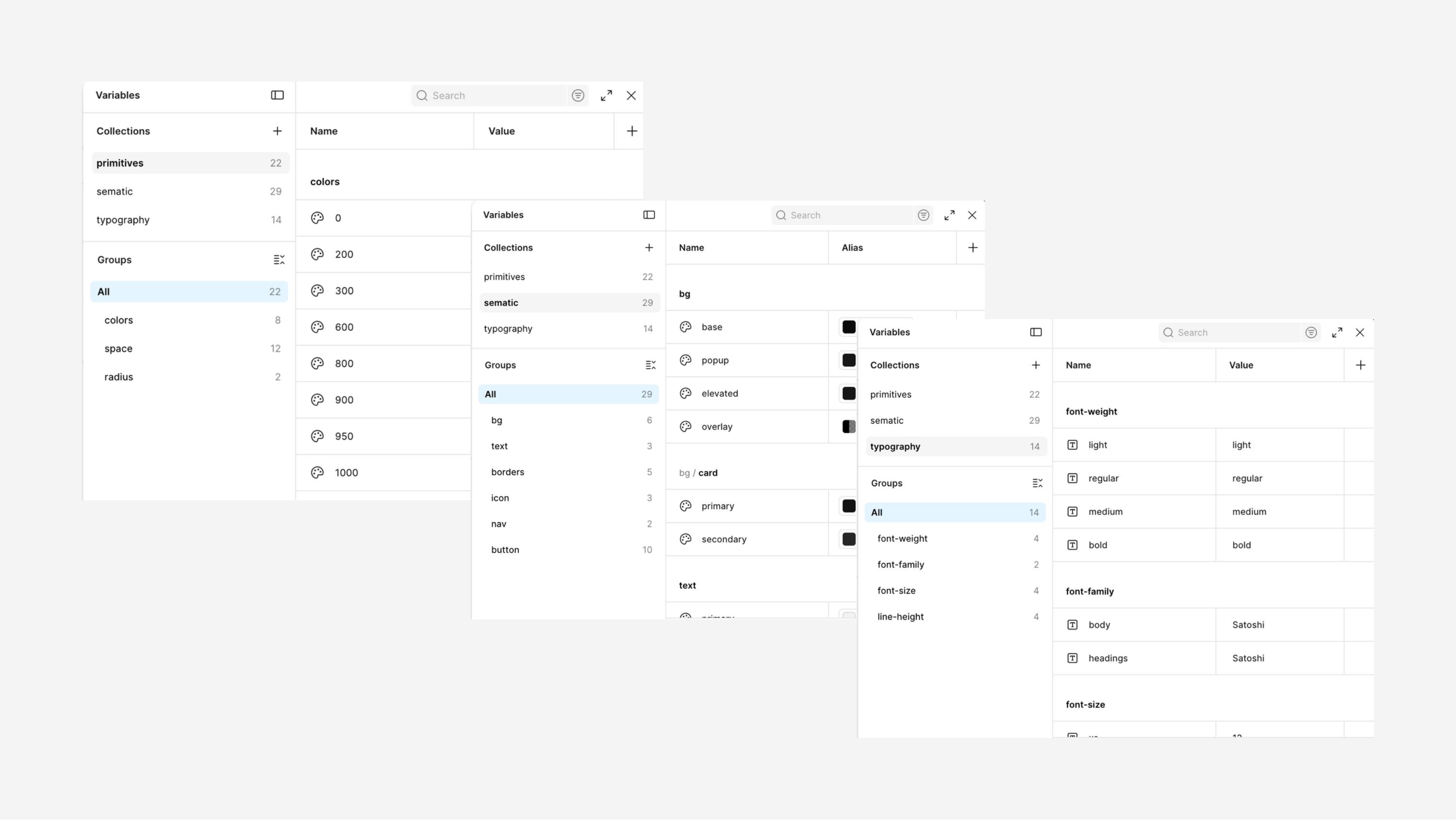
My individual responsibility focused especially on building and managing reusable components and variables in Figma, which helped create consistency across the interface and made it easier to make changes across multiple screens.
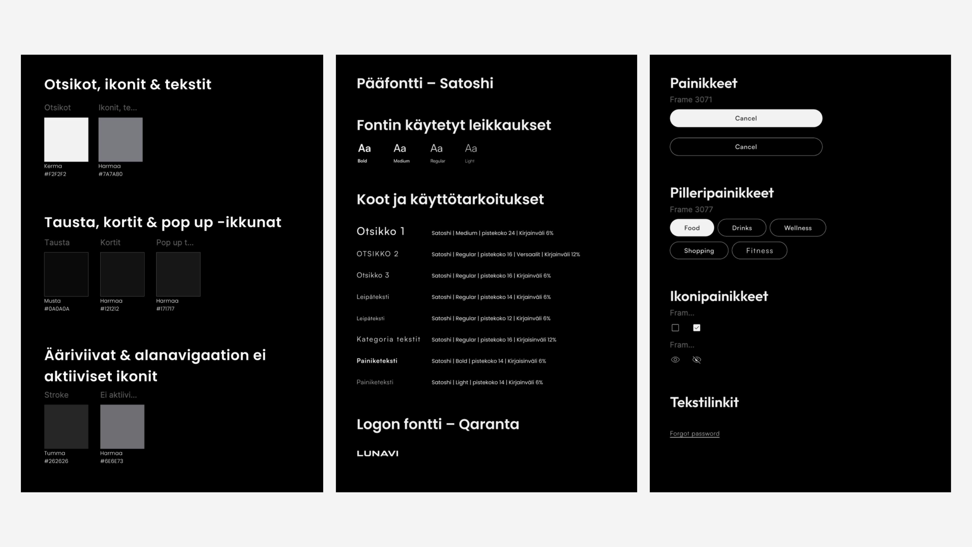
Figma components & variables
Components and variables became an important part of my workflow during the project. I learned to think about UI elements as reusable building blocks rather than individual objects, which made the design process more systematic and helped maintain consistency across the application. Variables also made it possible to manage changes more efficiently across the design system.
Visual direction
Alongside the UX work, we developed a new visual direction for the application, exploring typography, colour, layout, spacing and visual hierarchy to create a modern and cohesive interface.
The goal was to create an interface that not only looked more polished, but also supported usability by making information easier to understand and navigate.